
PELITAS CASE STUDY

Brand Identity
User Experience

Messaging
OBJECTIVE
Clarify, strengthen and modernize the brand identity of DCS Global, a leader in the patient access industry.
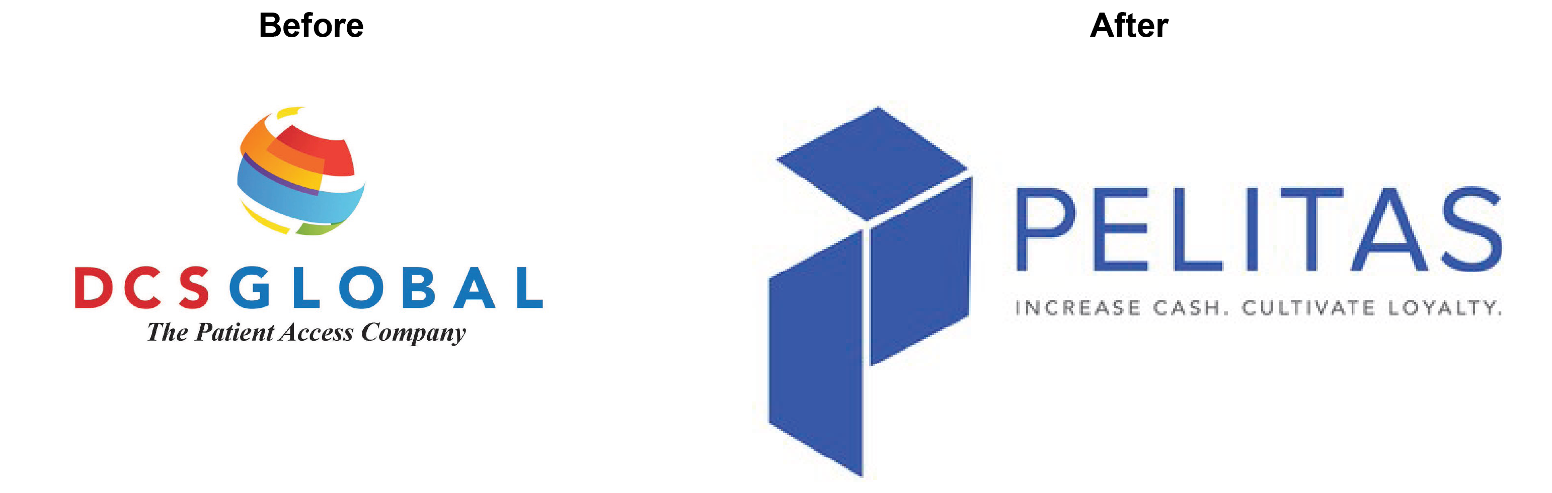
Name & Tagline Clarity
Shifted from a vague and buzz-word-heavy identity tag to a clear, specific and sticky name and tagline.
Branded elements highlight on the WHY for the company more than the jargon of the industry.
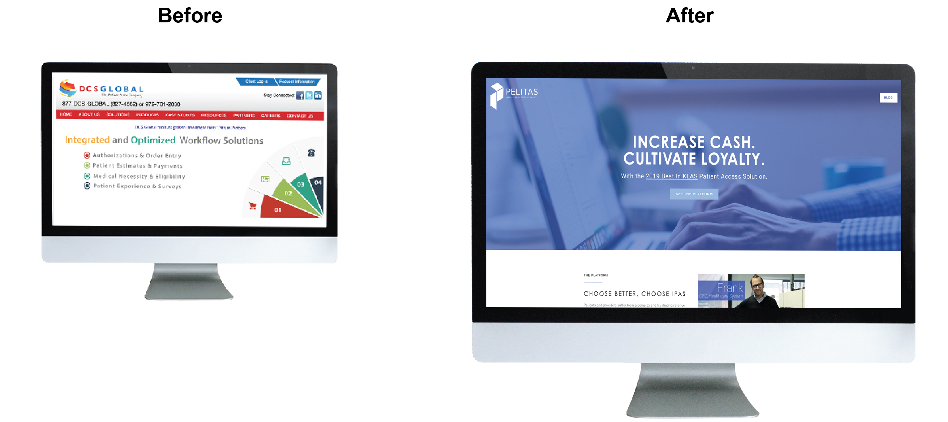
Marketing Refresh
New brand identity flowed through to entire marketing strategy.
Focus on addressing client needs, developing an engaged userbase and creating a blog strategy to draw in like-minded industry leaders.
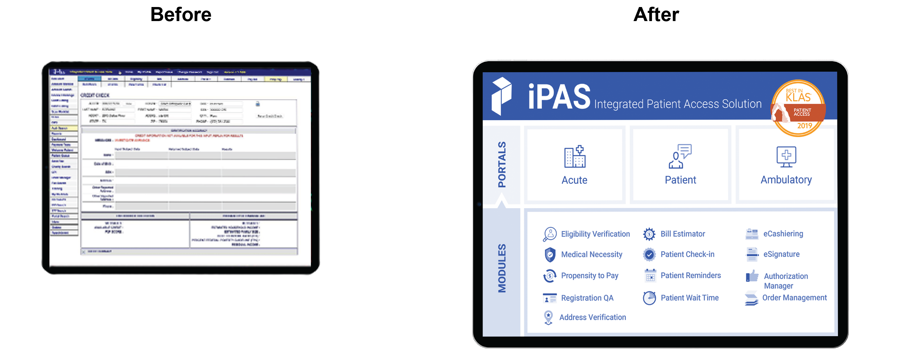
Resulted in 2019 Best In KLAS Patient Access Solution award.
ONCE REVAMPED, PELITAS WAS NAMED 2020 BEST IN KLAS® FOR PATIENT ACCESS TECHNOLOGY
User Experience
Distilling the category language down to its basic component parts helps to understand where we have a right to play and where consumers are coming from when shopping.
Most packaging for similar products had images related to the product, warm colors, felt natural, and easy to read.
Specific logos seen at the retailer were either combination marks or emblems and had a traditional feel.